Responsive Web design is where the design and development of a website takes into account the user's screen size and preferred device. The elements of the web page are designed to be fluid and display the optimum way for the users screen size. It consists of flexible grids, layouts, images and a mixture of CSS media queries.
What does it do?
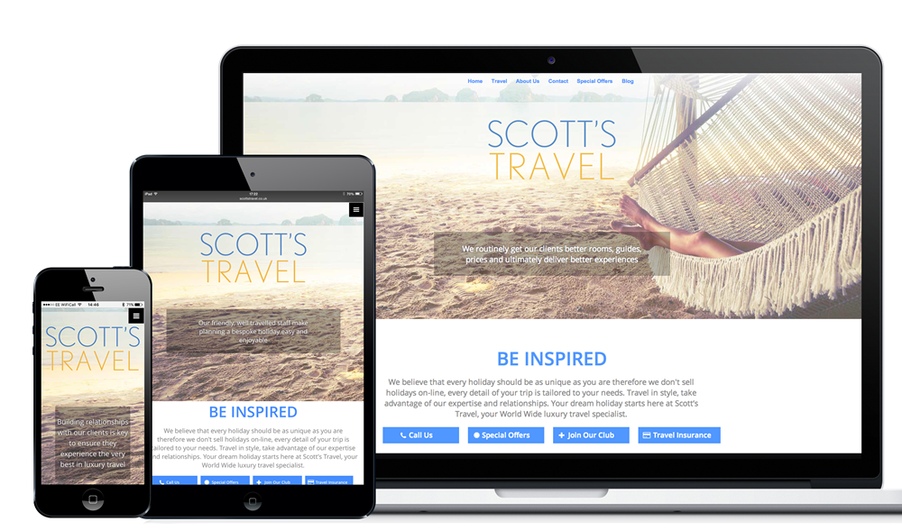
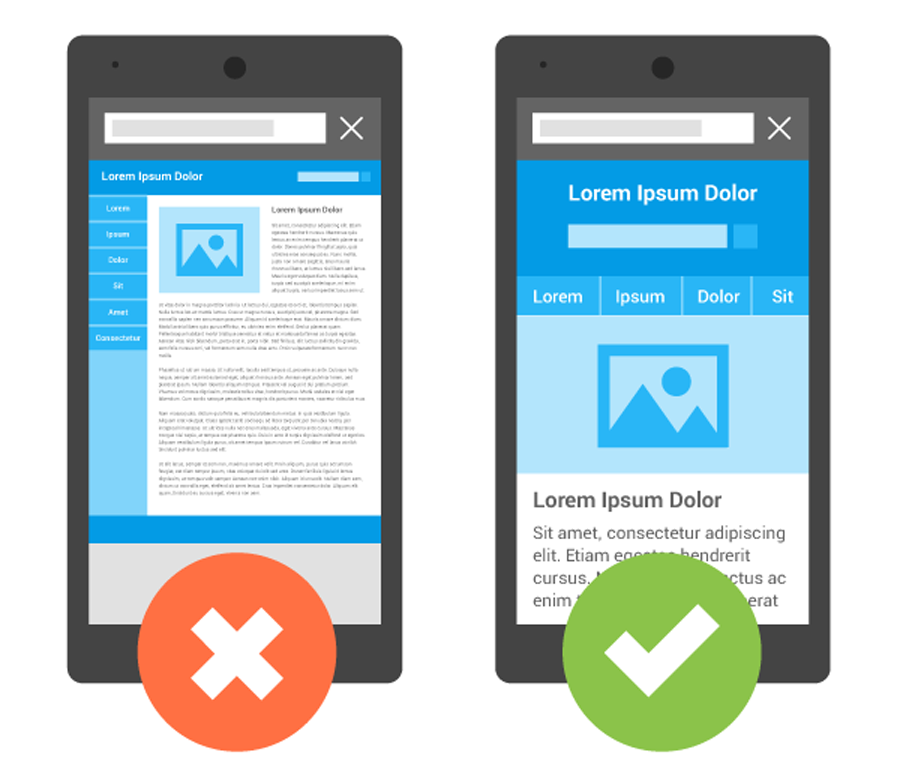
Responsive design means that rather than having separate websites for separate devices, you have one website that is coded to adapt to all screen sizes, no matter what device the website's being displayed on. If you're viewing the website on your tablet, you should then be able to view it on your laptop without any issues.
You can see examples of how responsive design works on our website.
What does Google think?
Google's Think Insights on mobile says that if someone lands on your website using a mobile and is frustrated or not happy with the viewing experience, that there is a 61% chance that they will leave to go onto another website. However if they have a positive experience, there is a 67% chance that they will use your products or services.
Google began adding a 'mobile-friendly' label to websites that were responsive, when responsive design first became available, so that when people were browsing on a mobile they could clearly see which websites were best optimised to use on the device they were using. As of April 2015 Google began rewarding websites that were built responsively due to having multi-device support. This means that if your website is not mobile responsive, you could be suffering in mobile search rankings.
Google recommends that your website is now fully responsive as part of their requirements for search rankings and have done so for a while now. You can test to see whether your website passes Google's mobile friendly check. Therefore Responsive Design is now an important factor when it comes to Search Engine Optimisation.
Is responsive design here to stay?
Responsive Design is the perfect solution for web designers/developers who have been battling with different versions of websites to cater to different screen sizes, devices, browsers and more. It's technically a one-size fits all solution.
This means your website is future proofed. For example if a new device became available with a new screen size/resolution, having a responsive design would mean that your website is already prepared and optimised to look good and be easily accessed.
Responsive Design is an investment when it comes to your marketing strategy.